
The argument in favor of using filler text goes something like this: If you use any real content in the Consulting Process anytime you reach.


Designing Readable Banners for Busy Market Stalls
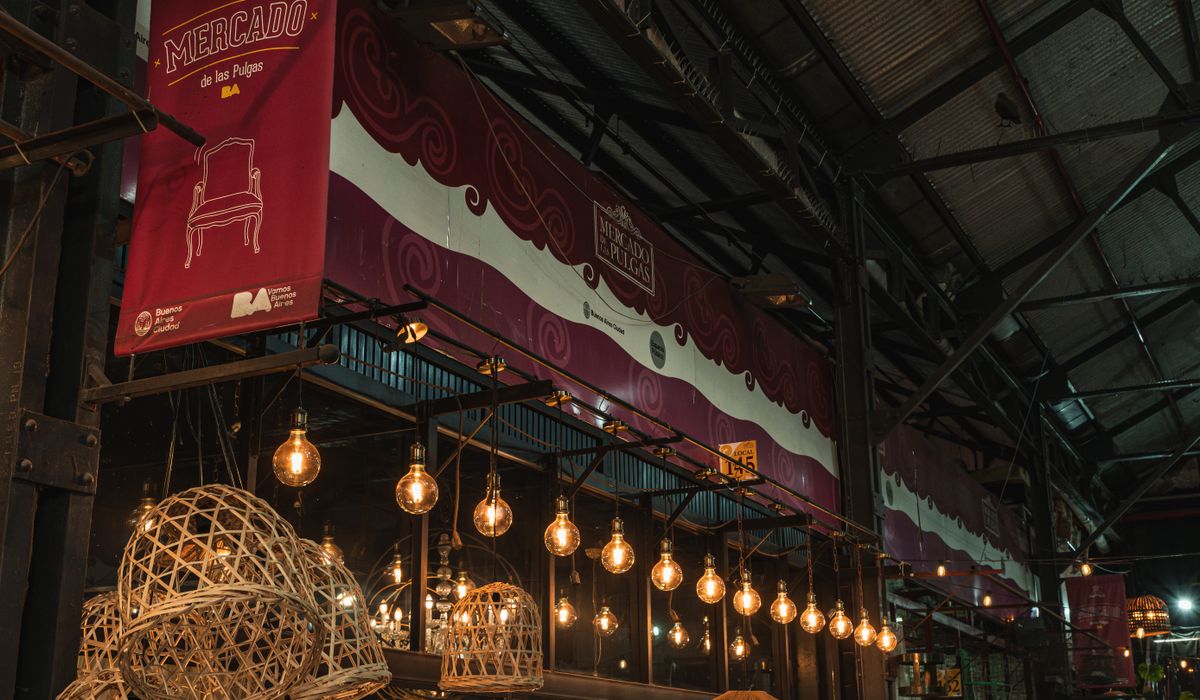
Why Market Stall Banners Play by Different Rules
A banner that looks brilliant on a laptop screen can be almost unreadable once it is strung across a gazebo on a crowded Saturday. Brighton's markets are busy in a very particular way: narrow aisles, stalls packed shoulder to shoulder, shoppers moving at a stroll with bags and buggies, and a great deal of visual noise competing for the same pair of eyes. You are not designing a poster to be studied. You are designing something that has to land in about two seconds, often at an angle, often while someone is mid-conversation.
So the question to keep asking yourself is not "does this look good?" but "can a stranger read this while walking past?" Everything below follows from that one test.
Decide the One Thing Your Banner Has to Say
Most stall banners fail because everything on them is the same size. When every word shouts, nothing is heard. Build a clear hierarchy instead, with no more than three tiers of information.
- Tier one: what you sell or what you are, in two to four words. This should be roughly twice the size of anything else.
- Tier two: the reason to stop — "Baked fresh from 7am", "Hand-poured in Hove", "Everything under a fiver".
- Tier three: practical details — card payments, vegan options, your social handle.
If a line of text does not fit one of those three jobs, it probably belongs on a small chalkboard at the front of the stall, where people are already close enough to read it.
Letter Sizes That Actually Work at Distance
There is a useful rule of thumb for signage: a capital letter about 25mm tall reads comfortably at roughly 3 metres, 50mm at about 6 metres, and 100mm at about 12 metres. Work backwards from where your furthest viewer will stand — often the far end of the aisle, or the other side of the road.
For a gazebo banner sitting at around 2.1 to 2.4 metres, most passers-by will be two to four metres away and looking up slightly. That means capitals of 100mm to 150mm for your main message are generous and safe, not excessive. For anything you genuinely want read, keep capitals at 30mm minimum. If a line of text cannot be that big, cut the line rather than shrinking it.
Type Choices: Weight, Spacing and the Script Trap
Legibility at distance comes down to letterform clarity. A few practical habits make a real difference.
- Choose bold or heavy sans serifs. Thin, light and hairline weights disappear against a busy background.
- Avoid long strings of capitals. All caps work for a two or three word headline, but whole sentences lose the word shapes our eyes rely on.
- Do not squeeze your lettering. Tight tracking and condensed faces make words run together, especially when viewed at an angle.
- Add a little extra letter spacing to all-caps headlines so each letter has room to breathe.
- Skip scripts, outlines, drop shadows and gradients behind letterforms. They look decorative up close and turn to mush from across an aisle.
Contrast, Colour and Brighton Light
Contrast matters far more than the colours you happen to like. Dark text on a light background is generally the most legible combination at distance; light text on dark works well and looks considered, but needs a heavier weight to hold up. Whatever you choose, test it in greyscale — if the contrast disappears when the colour does, it is not strong enough.
Be cautious with mid-tone pairings such as red on green, blue on purple or orange on yellow, and remember that roughly one in twelve men has some form of colour vision deficiency. Never place text directly over a busy photograph or a patterned background; give it a solid block of colour to sit on. Finish matters too: a matte surface is a better choice for south-facing pitches along the seafront, where gloss laminate will simply mirror the sun back at your customers. In the shaded streets of the North Laine, by contrast, a slightly brighter, higher-contrast design will hold attention better.
Layout, Fixing and a Final Sanity Check
Leave a clear border of at least 50mm around the edge of the artwork so nothing important is lost to hemming or eyelets, and keep the key message away from the corners where a gazebo frame may clip it. If your pitch is exposed — Madeira Drive on a windy day, for instance — specify a mesh banner so gusts pass through rather than turning your signage into a sail, and ask for reinforced hems and brass eyelets at sensible intervals.
Before you commit to print, do the squint test: print your design at A4, pin it to a wall, walk back five or six paces and squint. Whatever still reads is doing its job. Then take a photo on your phone and view it as a thumbnail — that is close to how your banner will appear in a crowded market. If you can still read the main message, you have got it right.

Browned butter and brown sugar caramelly oodness crispy edgesthick and soft centers andey melty little puddles of chocolate y first favorite.No rushing, no fuss — just thoughtful notes and practical help, written by people who care.
Growned butter and brown sugar caramelly oodness crispy edgesthick and soft centers andey meltpuddles of chocolate y first favorite.Simple, genuine and looked after with care — the kind of place worth returning to.
Accurate measurements prevent costly errors when ordering shop front signs. This practical guide covers height, width, fixing points and safe access considerations.
Thomas A. Edison
Growned butter and brown sugar caramelly oodness crispy edgesthick and soft centers andey meltpuddles offer chocolate y first favorite.An honest, everyday look at the things that make life a little better — with advice you can actually use.e breathing, we blessed. Surround yourself with angels.

Customer Engagement Marketing New Strategy for the Economy
Building site banners face wind, rain and dirt. Compare reinforced PVC, mesh and fabric options to keep your project message visible for longer.
- Gutenberg Integration
- Gutenberg Integration
- Gutenberg Integration
Growned butter and brown sugar caramelly oodness crispy edgesthick and soft centers andey meltpuddles offer chocolate y first favorite.Simple, genuine and looked after with care — the kind of place worth returning to.e breathing, we blessed. Surround yourself with angels.

Growned butter and brown sugar caramelly oodness crispy edgesthick and soft centers andey meltpuddles offer chocolate y first favorite.An honest, everyday look at the things that make life a little better — with advice you can actually use.e breathing, we blessed. Surround yourself with angels.

Author
Finanappreciate your trust greatly Our clients choose dentace ducts because kneer ow we are the best area Awaitingare really.

Previous Post


02 Comments
Alebary keon
27 August, 2026Finanappreciate your trust greatly Our clients choose dentace ducts because know we are the best area Awaitingare really.
Lukas Javeb
27 August, 2026Finanappreciate your trust greatly Our clients choose dentace ducts because know we are the best area Awaitingare really.