
The argument in favor of using filler text goes something like this: If you use any real content in the Consulting Process anytime you reach.


How to Prepare Artwork Files for Banner Printing
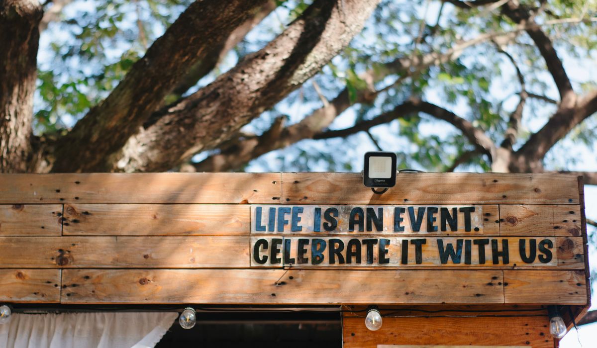
Why artwork preparation makes or breaks a banner
A banner is one of the most visible things a Brighton business can put its name on. It might be a three-metre PVC banner above a shopfront in the North Laine, a feather flag pulling footfall along Madeira Drive, a fabric backdrop behind a stall at a weekend market, or a rigid signboard outside a café in Kemptown. Whatever the format, the printed result is only ever as good as the file you send to production.
In our experience, most jobs that get delayed are not delayed by the printer. They are held up because the artwork arrives at the wrong size, in the wrong colour space, or with fonts that have gone missing. None of these problems is difficult to fix, but all of them take phone calls and time you probably do not have. This guide walks through the checks that matter most before your files go anywhere near a press.
Start with resolution and real-world size
Large format printing is more forgiving than a leaflet, but only up to a point. The key rule is that resolution and size work together.
- Supply artwork at 100% of the finished size wherever possible, or at a clearly stated scale such as half or quarter size.
- For banners viewed from a few metres away, 150 dpi at full size is usually plenty. If you are working at quarter size, aim for 600 dpi so the effective resolution stays high.
- For close-up displays such as a pop-up stand or a counter card, work at 300 dpi at full size.
- Never upscale a small image. A logo pulled from a website and blown up to two metres will look soft and blocky, and no amount of sharpening will rescue it.
Remember that viewing distance does the heavy lifting. Text you can read from across a road needs to be far larger than text on a stand read from a metre away.
Set up bleed, safe areas and finishing allowances
Banners are not simply trimmed flat. Most have a welded hem and eyelets, which takes roughly 25mm from each edge. Anything important placed inside that zone risks disappearing into the hem or being punched through.
- Keep all text and logos at least 50mm from the finished edge.
- If your design has a background colour or image running to the edge, extend it beyond the trim by 3–5mm of bleed on printed signs, or by the full hem allowance on banners.
- Allow extra space if you are adding pole pockets, which typically need 75mm or more at the top and bottom.
- Check the final dimensions twice. A banner measured in metres but supplied in millimetres will come back the wrong size and there is no way to shrink print.
Work in CMYK, and understand what shifts
Screens glow in RGB; presses print in CMYK ink. The two are not the same, and some colours simply cannot be reproduced.
- Convert your file to CMYK before exporting, and check the result on screen rather than trusting the automatic conversion.
- Deep electric blues, vivid greens and neon pinks will look flatter in print. If those colours are central to your brand, choose a slightly warmer or deeper version you are happy with.
- Rich black text is a common trap. For small type, use 100% K only, otherwise the edges may look fuzzy.
- If an exact brand colour matters, quote a Pantone reference so your printer can match it as closely as the material allows.
- Banner vinyl, mesh and fabric all take ink differently, so expect a small variation between materials.
Embed fonts or convert them to outlines
Missing fonts are the single most common cause of reprints. If you send a file that references a font your printer does not have, the software substitutes something else and your carefully chosen typography changes.
- Either embed all fonts when exporting, or convert text to outlines and save a copy.
- Keep the original editable version, because outlined text can no longer be corrected for spelling.
- Use vector artwork for logos wherever possible. Vector files scale to any size without losing sharpness.
- Avoid very thin script fonts at large sizes, as fine strokes can break up or look spindly from a distance.
Choose a sensible file format and check before sending
For most banner, signage and event display work, a print-ready PDF is the safest choice. TIFF and EPS are also widely accepted. Avoid sending low-quality JPEGs, and never send a screenshot, a Word document or an image pasted into a slide.
Before you upload, run through this quick checklist:
- Dimensions correct, including scale clearly labelled.
- Bleed and safe areas in place.
- Colour mode set to CMYK.
- Fonts embedded or outlined.
- Images at the right resolution, not stretched out of proportion.
- Spelling, phone numbers, web addresses and dates checked by a second pair of eyes.
Finally, ask for a proof if there is any doubt. A small low-resolution proof will not show every texture, but it will confirm layout, colour and spelling. Ten minutes of checking now saves a week of waiting for a reprint, and it means your banner goes up looking exactly as you imagined it on the Brighton seafront.

Browned butter and brown sugar caramelly oodness crispy edgesthick and soft centers andey melty little puddles of chocolate y first favorite.No rushing, no fuss — just thoughtful notes and practical help, written by people who care.
Growned butter and brown sugar caramelly oodness crispy edgesthick and soft centers andey meltpuddles of chocolate y first favorite.Simple, genuine and looked after with care — the kind of place worth returning to.
Colours can shift between vinyl, mesh and fabric. Understand material profiles and lighting conditions to keep brand colours consistent across every display.
Thomas A. Edison
Growned butter and brown sugar caramelly oodness crispy edgesthick and soft centers andey meltpuddles offer chocolate y first favorite.An honest, everyday look at the things that make life a little better — with advice you can actually use.e breathing, we blessed. Surround yourself with angels.

Customer Engagement Marketing New Strategy for the Economy
Indoor hanging banners require careful fixing and safe clearance. Learn about rails, cables and lightweight materials suitable for retail ceilings and walls.
- Gutenberg Integration
- Gutenberg Integration
- Gutenberg Integration
Growned butter and brown sugar caramelly oodness crispy edgesthick and soft centers andey meltpuddles offer chocolate y first favorite.Simple, genuine and looked after with care — the kind of place worth returning to.e breathing, we blessed. Surround yourself with angels.

Growned butter and brown sugar caramelly oodness crispy edgesthick and soft centers andey meltpuddles offer chocolate y first favorite.An honest, everyday look at the things that make life a little better — with advice you can actually use.e breathing, we blessed. Surround yourself with angels.

Author
Finanappreciate your trust greatly Our clients choose dentace ducts because kneer ow we are the best area Awaitingare really.

Previous Post


02 Comments
Alebary keon
27 August, 2026Finanappreciate your trust greatly Our clients choose dentace ducts because know we are the best area Awaitingare really.
Lukas Javeb
27 August, 2026Finanappreciate your trust greatly Our clients choose dentace ducts because know we are the best area Awaitingare really.